Each recipe below builds one custom view from a small set of primitives. The passcode view takes keyboard input and maps it to dots. The bottom menu follows a drag gesture and snaps between heights. The circular text measures each character and rotates it around a circle. The first two use UIKit, the third uses SwiftUI. Each recipe links to its full source code.
1Passcode view
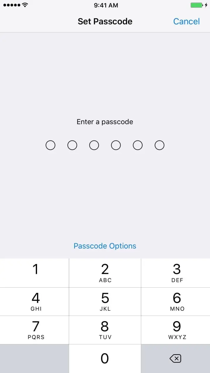
The passcode view can becomeFirstResponder and resignFirstResponder to show and hide the virtual keyboard when needed. That makes it behave much like a TextField.
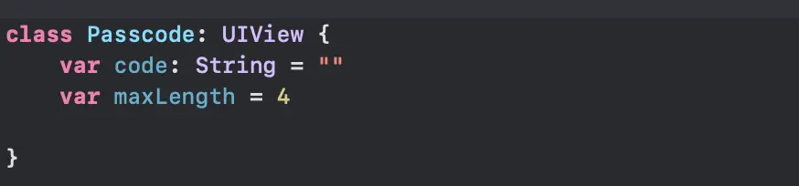
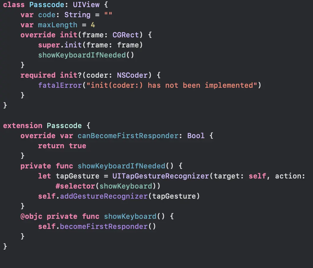
Define the passcode view:
1.1Show the keyboard
By default, the user must touch a TextField or TextView to show the keyboard. A custom view becomes a keyboard input view when it overrides canBecomeFirstResponder and conforms to the UIKeyInput protocol.
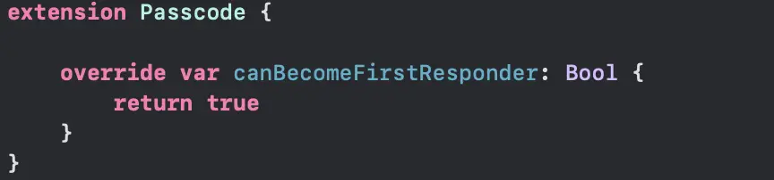
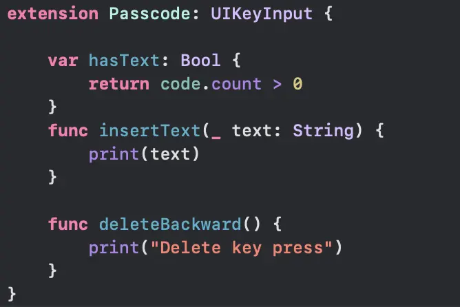
Now the view can show the keyboard. Test it by calling passcode.becomeFirstResponder().
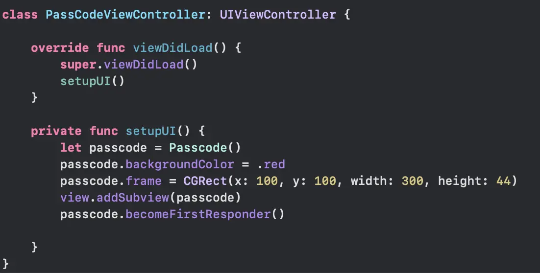
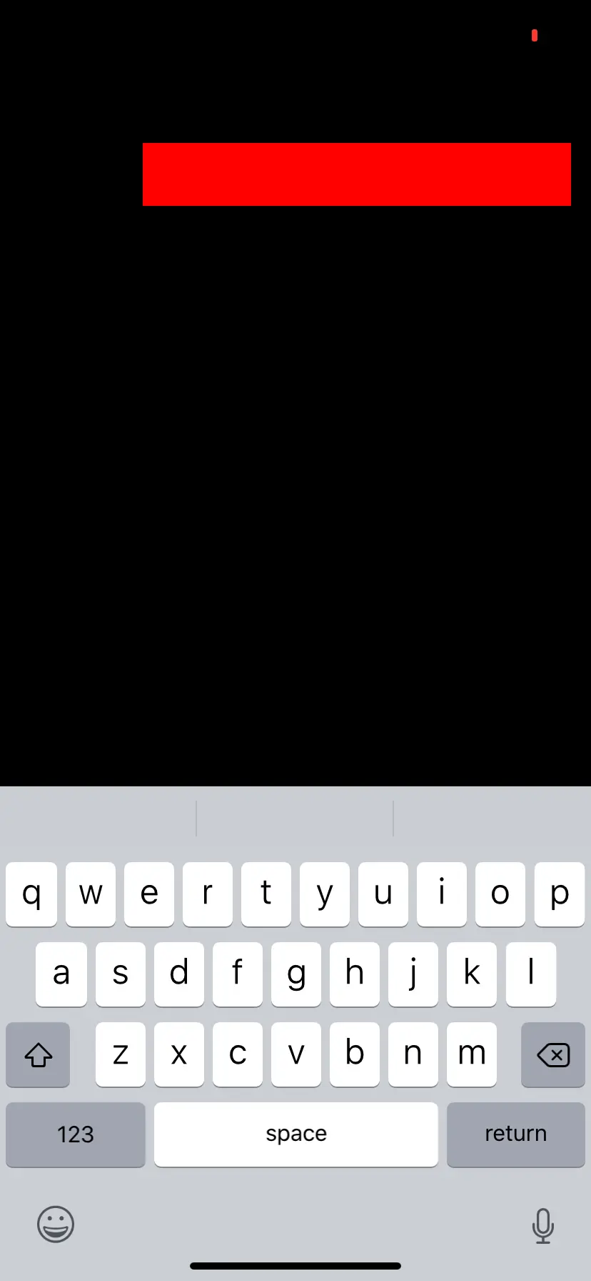
To make the view easy to use, add a tap gesture that calls becomeFirstResponder(). Now a tap shows the keyboard.
1.2Handle the input
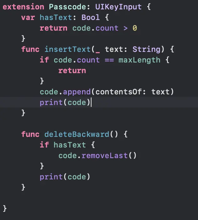
The input logic centers on three methods:
Append to or delete from the code string as needed:
1.3Map the code to PIN dots
With the logic finished, the next challenge is mapping the code to a PIN UI when the code changes. Add a UIStackView to the passcode view. The stack distributes "dot views" as the PIN.

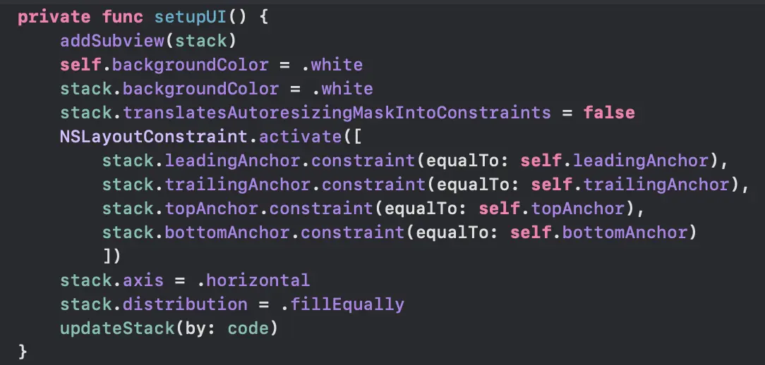
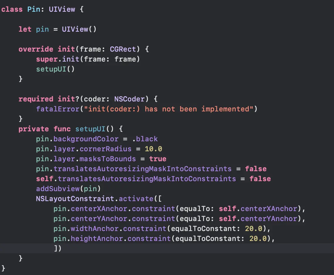
Create the PIN view:
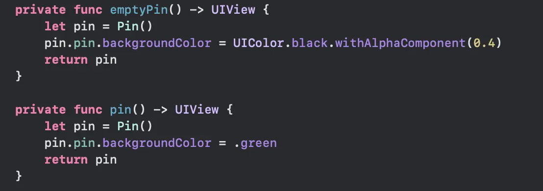
Create two helper methods, one for an empty pin and one for a normal pin:
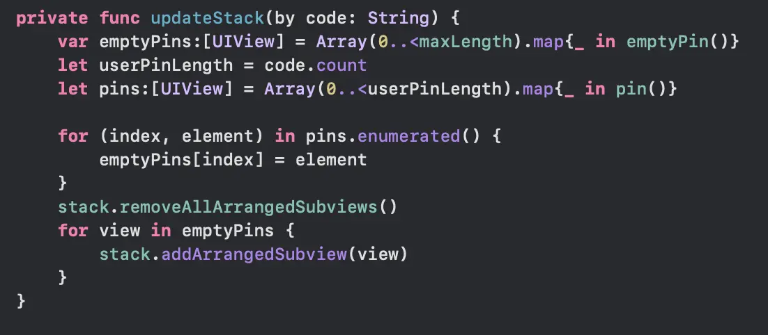
Map the user's input code to an array of pin views and distribute them in the stack:
Add a helper method that removes all arranged subviews from the stack:
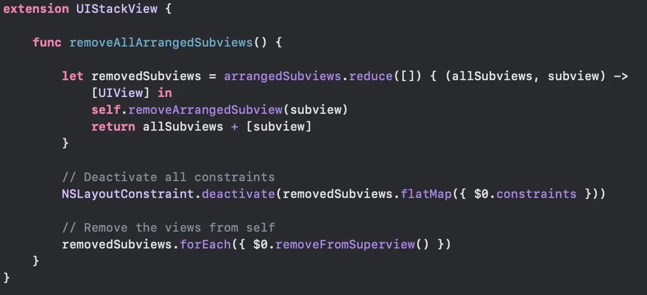
Call the stack update when the code changes:

1.4Test and finish
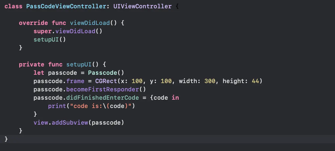
Create a view controller to test the stack:
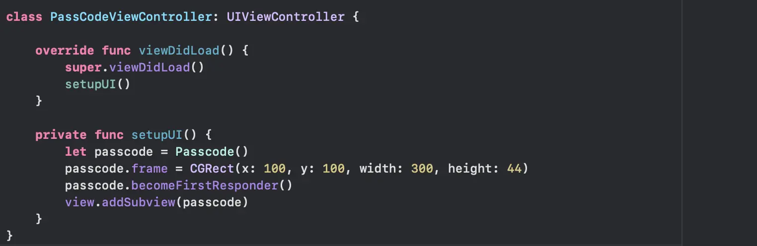
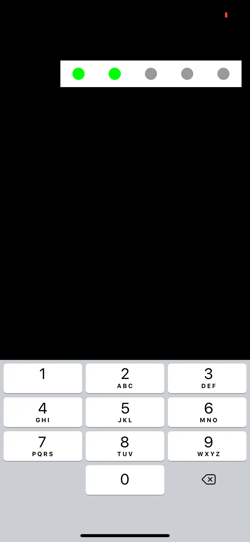
Make PasscodeView conform to UITextInputTraits so you can set the keyboard to the number pad:

Result:
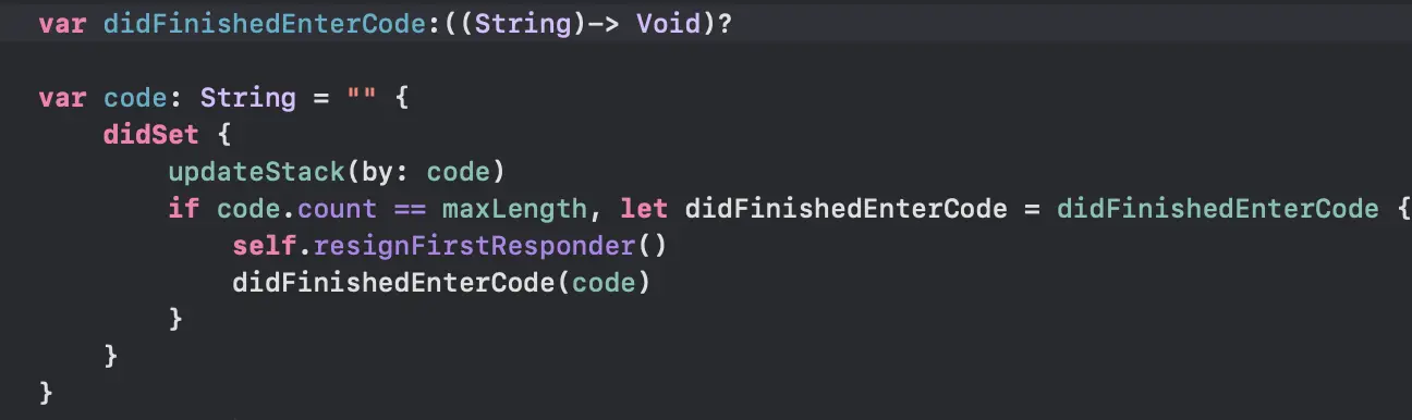
Add a callback for when the user finishes the input:
Full source code: Passcode on GitHub. The project was written in Xcode 11 beta. Copy all the Passxxx and Pin files into your Xcode project to test.
2Draggable bottom menu
This recipe recreates the bottom menu of Apple's Find My app in a few lines of code. The device list menu has three states: collapsed, half expanded and expanded.
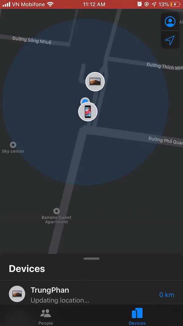
The view needs to do two things:
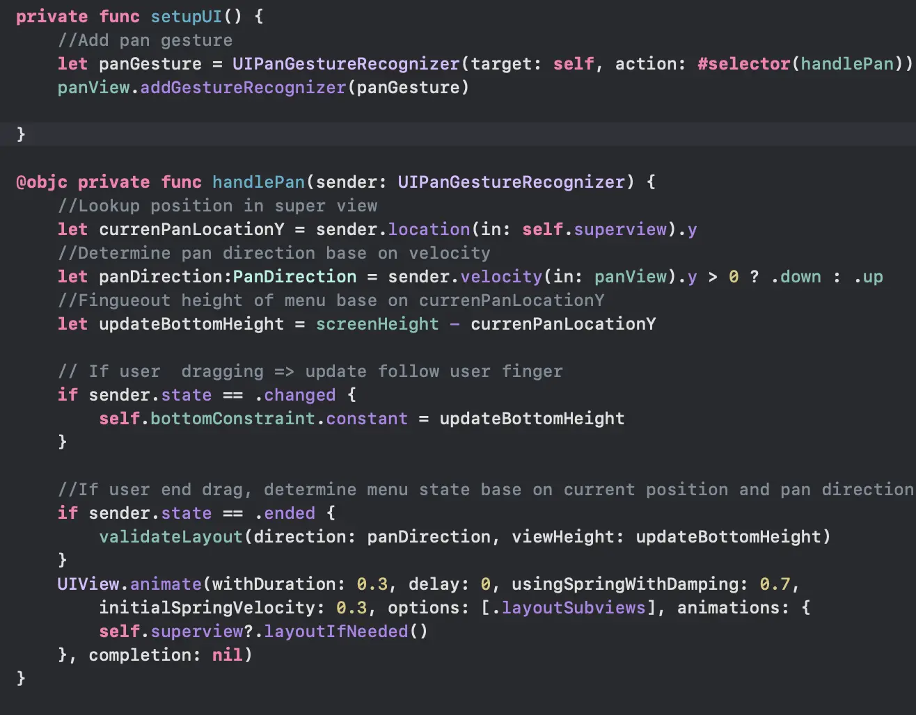
- Update its own height to follow the user's finger while dragging (pan gesture).
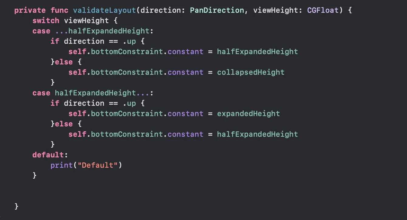
- Resize its height automatically, based on the direction of the drag and the position compared to the "half position".
2.1Set up the view
Create an Xcode project and add a new UIView named BottomMenuView.
Add a PanView as a subview of BottomMenuView. Constrain its leading, trailing and top edges to the superview and set the height constraint to 44.0. The PanView tracks the user's finger with a UIPanGestureRecognizer.
Add a bottom constraint for the PanView, and make outlets for the PanView and the bottom constraint. Xcode may warn about conflicting constraints, which is fine.
2.2Write the code
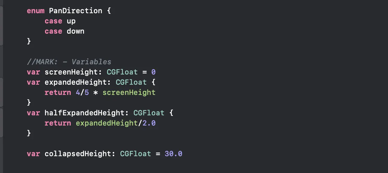
Define some variables to set the menu heights:
Add a pan gesture to the panView and handle the pan event:
Update the menu height based on the drag direction and position:
Set up the UI and the initial menu height in awakeFromNib:

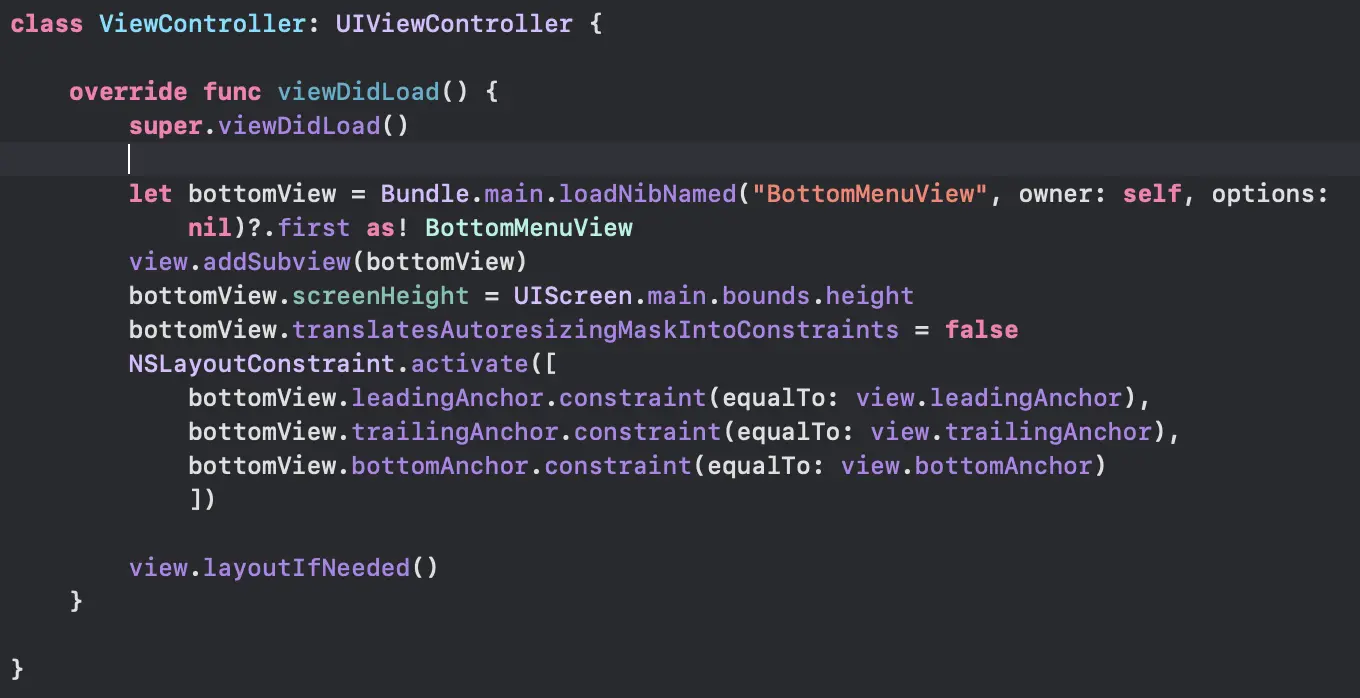
Finally, test the menu by adding it to a view controller:
Full source code: BottomMenu on GitHub.
3Circular text in SwiftUI
This recipe lays text along a circle in SwiftUI.
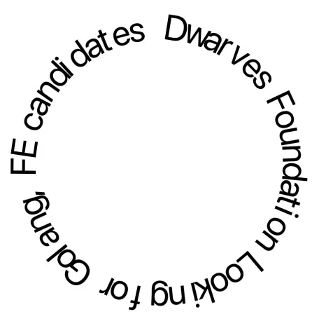
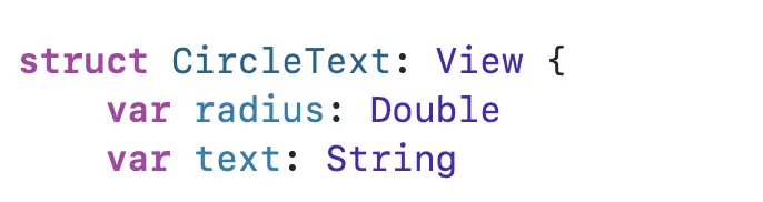
Open Xcode, create a new SwiftUI project, and add a new SwiftUI file named CircularText. The first two attributes of the control are the string and the radius of the circle.
3.1Split the string
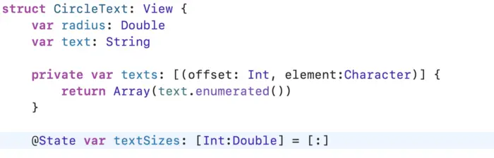
To make circular text, split the string into an array of characters. Each character gets its own Text control, and each control is rotated to match the circle. Define a computed property that splits the string into an array of characters:

Use enumerated to get the offset, which is needed later.
3.2Compute the angle
To calculate the rotation angle you need two things: the perimeter of the circle and the width of each character.
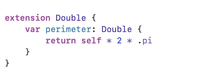
The perimeter is used later through radius.perimeter.
The width of each character is harder. The character must sit in some control, and the control must report its size. Text is the best candidate. Embed the Text and a Spacer in a VStack. This gives a custom control as tall as the parent view, with the text at the top, which makes rotation easy because you only need to rotate around the center of the control.
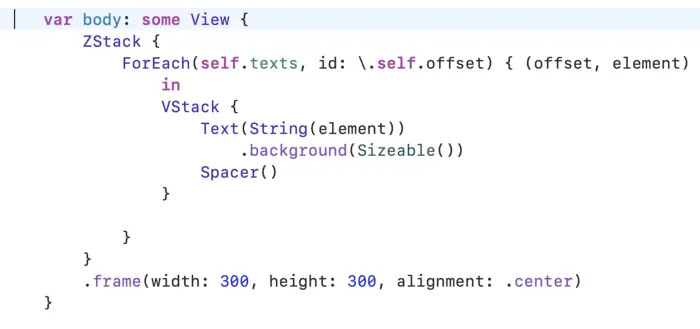
Now there is a list of Text views and the next step is getting each width. SwiftUI lets you read a control's size with GeometryReader, and you send it outside the view with a PreferenceKey.
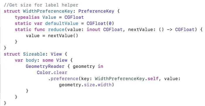
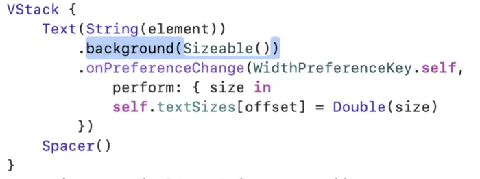
Place the custom Sizeable view as the background of the Text. A Sizeable view is actually a Color, so it fills its parent (the background of the Text) and reports exactly the size of the Text. To store the sizes, add a dictionary named textSizes. The key is the position of the character.
Update the VStacks to save the sizes when the preference changes:
With the perimeter and each character's width, calculate the angle of each character by its position:
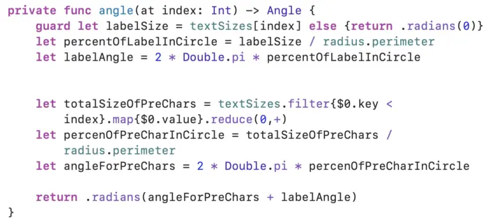
This function calculates what percentage of the perimeter the character's width takes, then derives the angle from that percentage.
3.3Rotate and adjust
With the angle in hand, apply the rotation and look at the result:
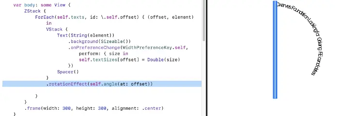
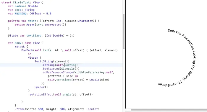
The spacing between characters looks wrong. It only fits horizontal text, and the rotation pushes the characters close together. The built-in kerning modifier adjusts the spacing.
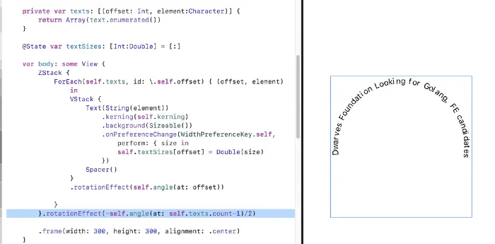
To center the text, take the angle of the last character, divide it by 2, and rotate the whole text anticlockwise by that amount.
Full source code: SwiftUIGeometryPractice on GitHub.