SwiftUI writes UI code declaratively. This two-part tutorial brings the same style to UIKit. Part one builds a fluent builder pattern from @discardableResult and extensions. Part two adds @resultBuilder so that stack views and containers read like SwiftUI. By the end you can write a screen like this:
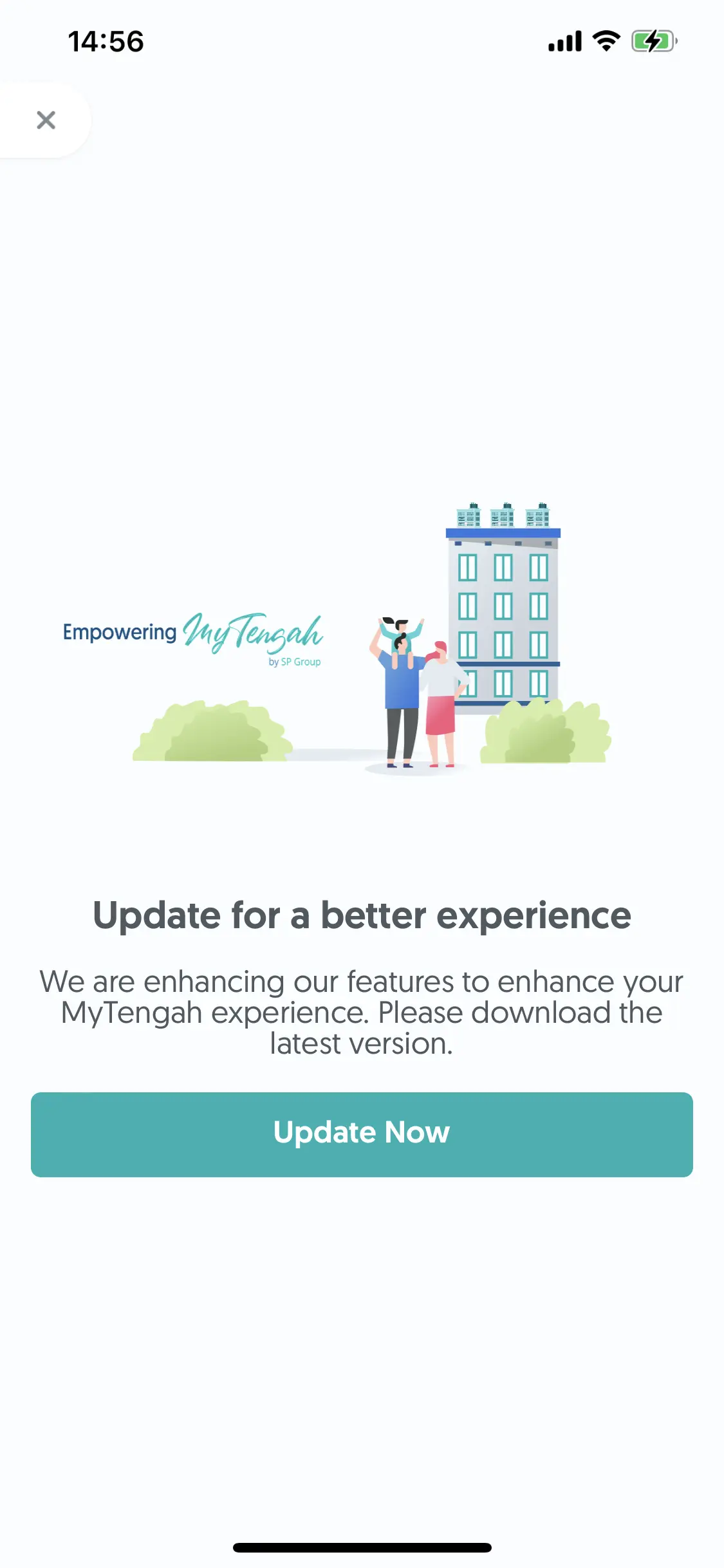
let vStack = UIVStack {
    UIImageView(image: UIImage(named:"banner"))
    UIView()
        .backgroundColor(.clear)
        .heightAnchor(height: 20)
    UILabel()
        .text(title)
        .font(UIFont.systemFont(ofSize: UIFont.largeSize))
        .textAlignment(.center)
        .color(.black60)
    UILabel()
        .text(subtitle)
        .font(UIFont.systemFont(ofSize: UIFont.normalSize))
        .textAlignment(.center)
        .color(.black60)
        .numberOfLines(0)

    UIButton()
        .spStyle()
        .title("Update Now")
        .tap(action: { [weak self] in
            self?.navigateToAppStore()
        })
        .heightAnchor(height: 44)
}
1Part 1: the builder pattern for UIKit
1.1The problem with plain UIKit
A simple login form in UIKit usually looks like this:
let txtUserName = UITextField()
txtUserName.placeHolder = "User Name"
txtUserName.textColor = .black8
//For text change event.
txtUserName.delegate = self

let txtPassword = UITextField()
txtPassword.placeHolder = "Password"
txtPassword.textColor = .black8
//For hide password
txtPassword.style = .password
txtPassword.delegate = self
For a small project that is fine. A large project needs standard design techniques, so the code can be reused and the app stays easy to maintain.
The usual fix is to subclass the original type and create components that follow the designer's style:
class MyStyleBlackTextFiled: UITextField {
	func setupUI() {
        self.textColor = .black8
        self.font = UIFont(systemFontOfSize: 18)
        self.backgroundColor = .white
    }
}

let txtUserName = MyStyleBlackTextFiled()
let password = MyStyleBlackTextFiled()
That works until the designer hands you a page with a different text color, background color and font size. You can add MyStyleRedTextField, but you cannot reuse the first class flexibly.
One alternative is a configuration method:
let textField = UITextField()

textField.config(textColor: .red, font: .system, backgroundColor: .white)

extension UITextField {
	func config(textColor: UIColor, font: UIFont, backgroundColor: UIColor) {
        //set
    }
}
It breaks down when you need to customize another property or add a new function. Keeping the code in sync with the design and reusable gets hard.
1.2@discardableResult
@discardableResult lets you use or ignore a function's return value without a compiler or editor warning. Take a function that returns a String:
func hello() -> String {
	"Hello"
}
Calling hello() alone makes the editor warn that the result is unused. You can silence the warning with _ = hello() or let _ = hello(). With the attribute, no warning appears:
@discardableResult()
func hello() -> String {
	"Hello"
}
You can still assign the result: let helloString = hello().
1.3Extensions
Extensions add functionality to existing types. A plain extension on UILabel looks like this:
extension UILabel {
    func textColor(_ color: UIColor) {
        self.textColor = color
    }
    func backgroundColor(_ color: UIColor) {
        self.backgroundColor = color
    }
}

use:
let label = UILabel()
label.textColor = .red
label.backgroundColor = .blue
An extension plus @discardableResult, with each method returning self, is the builder:
extension UILabel {
    @discardableResult
    func text(_ string: String) -> UILabel {
        self.text = string
        return self
    }
    @discardableResult
    func textColor(_ color: UIColor) -> UILabel {
        self.textColor = color
        return self
    }
}
Now properties chain:
let label = UILabel()
    .textColor(.red)
    .text("Hello")
label is still a UILabel, so every built-in property and method still works:
let text = label.text
let background = text.backgroundColor

label.text = "ABC"
To make your own style, write an extension with the same technique:
extension UILabel {
    @discardableResult
    func myRedStyle() -> UILabel {
        self.textColor(.red).backgroundColor(.green)
        return self
    }
}

let redLabel = UILabel().text("I'm red").myRedStyle()
The combination gives reusability, flexibility, maintainability and room to grow, and the original type stays intact.
2Part 2: containers with @resultBuilder
Part one creates and configures one view. Part two wraps container views, so a whole hierarchy reads as a block of code.
2.1From function builders to @resultBuilder
SwiftUI's VStack is built with a function builder:
VStack {
    Text("Hello world")
    Text("Dwarves Foundation Better Engineering")
}
Swift 5.4 introduced @resultBuilder. It extends the DSL capability from SwiftUI to the rest of the language, so you can use DSLs in more places in a codebase (the proposal has the detail). For example, an HTML form in Swift:
HTML {
    Body {
        P { "Hello HTML" }
        DIV {
            P{}
            P{}
            DIV{}
         }
    }
}
Apply the same idea to UIKit. With part one, UILabel("ABC", red) becomes a chain. The next step is a container. UIKit's stack views arrange subviews horizontally or vertically. The goal is to turn this:
let label = UILabel().text("ABC").backgroundColor(.red)

let stackView = UIStackView()
stackView.distribution = .center
stackView.axis = .horizontal
stackView.addArrangedSubview(label)
into this:
UIHStack {
    UILabel().text("ABC").backgroundColor(.red)
}
2.2The UIViewBuilder
A UIViewBuilder turns a list of views into an array of views:
@resultBuilder
public enum UIViewBuilder {
    public static func buildBlock(_ components: UIView...) -> [UIView] {
       components
    }
}
Use it directly, or on a function:
let views = UIViewBuilder.buildBlock(UILabel(), UIImageView(), UIView())
@UIViewBuilder func createUI() -> [UIView] {
    UILabel()
    UIImageView()
}
The block returns [UIView] and not a single UIView. The original tutorial promises to explain why and does not come back to it. The array is what lets you hand the views straight to a stack view without calling addSubview again and again.
That syntax works, but it is not pretty yet. Wrapper classes make it convenient:
public class UIVStack: UIStackView {
    public convenience init(@UIViewBuilder _ builder: () -> [UIView]) {
        self.init(arrangedSubviews: builder())
        self.distribution = .fill
        self.spacing = 16
        self.axis = .vertical
    }
}
UIVStack {
    UILabel()
    UIImageView()
    UITextField()
}
Add the horizontal stack and a stack that layers its children on top of each other:
public class UIHStack: UIStackView {
    public convenience init(@UIViewBuilder _ builder: () -> [UIView]) {
        self.init(arrangedSubviews: builder())
        self.distribution = .fill
        self.spacing = 16
        self.axis = .horizontal
    }
}

public class UIZStack: UIView {
    convenience init(@UIViewBuilder _ builder: () -> [UIView]) {
        self.init()
        builder().forEach { view in
            self.addSubview(view)
            view.translatesAutoresizingMaskIntoConstraints()
            view.fitToSuperView()
        }
    }
}
Combine these with the builder methods from part one, and UIKit code reads close to SwiftUI:
UIZStack(spacing: 16) {
    UIVStack(spacing: 16) {
        UIImageView(image: UIImage(named:"banner"))
        UIView()
            .backgroundColor(.clear)
            .heightAnchor(height: 20)
        UILabel()
            .text(title)
            .font(UIFont.systemFont(ofSize: UIFont.largeSize))
            .textAlignment(.center)
            .color(.black60)
        UILabel()
            .text(subtitle)
            .font(UIFont.systemFont(ofSize: UIFont.normalSize))
            .textAlignment(.center)
            .color(.black60)
            .numberOfLines(0)

        UIButton()
            .mintStyle()
            .title("Update Now")
            .tap(action: { [weak self] in
                navigateToAppStore()
            })
            .heightAnchor(height: 44)
    }
}
2.3Add if-else and loops
@resultBuilder has a static function buildEither for if-else and buildArray for loops. They work the same way buildBlock does:
public static func buildEither(first component: [UIView]) -> [UIView] {
}
public static func buildEither(second component: [UIView]) -> [UIView] {
}
public static func buildArray(_ components: [[UIView]]) -> [UIView] {
}
UIHStack {
    if true {
        UIView().backgroundColor(.red)
    } else {
        UIView().backgroundColor(.green)
    }

    for image in images {
        UIImageView(image: image)
    }
}
2.4Configure the container
Add parameters to the initializer to configure the container view:
public class UIVStack: UIStackView {
    public convenience init(alignment: UIViewAlignment = .center, spacing: CGFloat = 16,  @UIViewBuilder _ builder: () -> [UIView]) {
        self.init(arrangedSubviews: builder())
        self.distribution = .fill
        self.spacing = spacing
        self.alignment = alignment
        self.axis = .vertical
    }
}

UIHStack(alignment: .trailing, spacing: 8) {

}