
To almost fresher who started in Graphic design and Digital design, who wants to make our model look beautiful and right. When we - fresher receive brief directly from the client or leader, we start to search online for ideas. Honestly, those projects look pretty good, super clean, and all you want is your project look the same way as them, but you just CAN’T. That’s because you don’t do the same way they did. You might forget or skip the step called: “Build Layout.”
What is a layout and why it’s so important?
Here are some definitions I read online:
- The layout is the universal design tool. To layout, a page means to use photos, typography, space, icon, and ingredients to make a design own its story.
- Layout refers to the arrangement of elements on a page usually referring to the specific placement of image, text, and style. Understanding the layout of designs is very important. ... Proper layout enhances the look of the particular object and the objects as a whole piece of design in order to create a strong composition
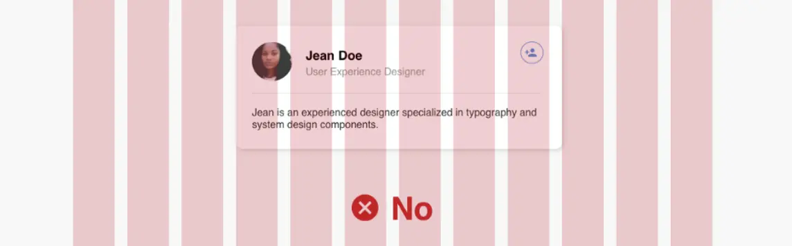
Let’s make it simple. Either you want your design looks like this:
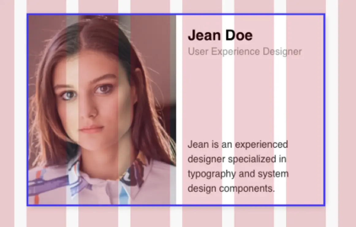
Or this
There are several things that make your work turn into “not good looking design” and one of that is you didn’t choose and prepare your layout good enough. (It happened to me once when I first started working as a visual designer).
There are 2 types of layout:
- Grid layout
- Free - formed layout
Grid
A grid is a network of lines. The grid lines typically run horizontally and vertically in evenly spaced increments, but grids can be angled irregular or even circular. A secret to strong layouts helps designers organize the information with hierarchy and others. It’s a guide, not a strict ruleset.
Grid in web and app design
As a fresher in digital design, this is what I’m understanding about Grid. There are 3 types of a grid:
- Row
- Column (I use this mostly)
- Grid
With Row and Column, we mostly have 12 counts, margin, width, gutter.
Field elements
It's a block of design, whether that be text, image, or both. Background colors don't count as field elements unless they are a container for your text/image. I've seen the name field element be interchangeable with units, elements, parent containers — they're all the same.
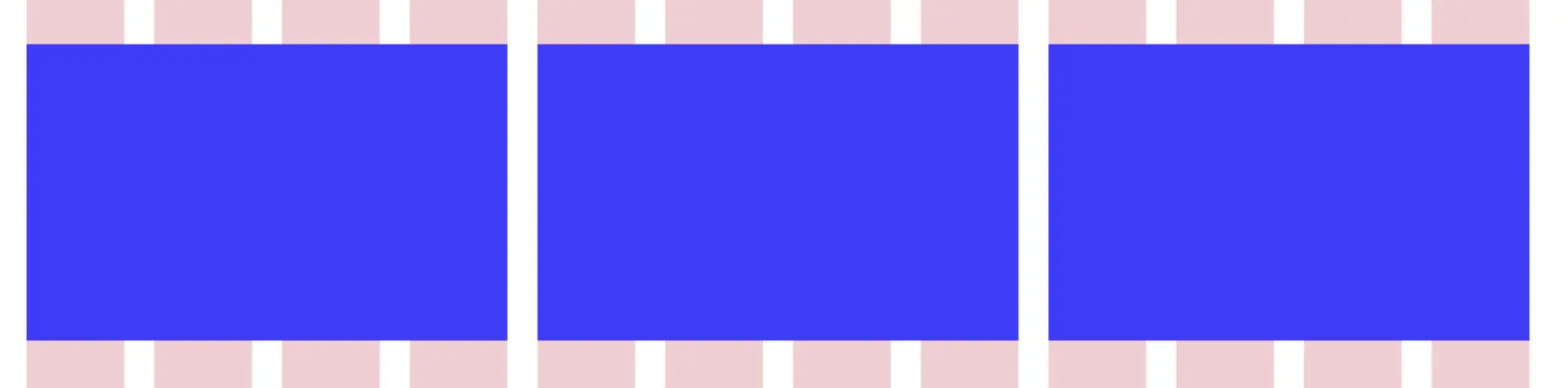
Columns
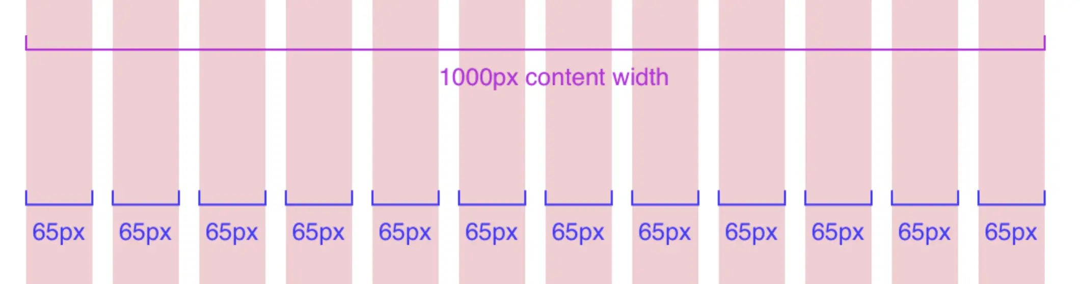
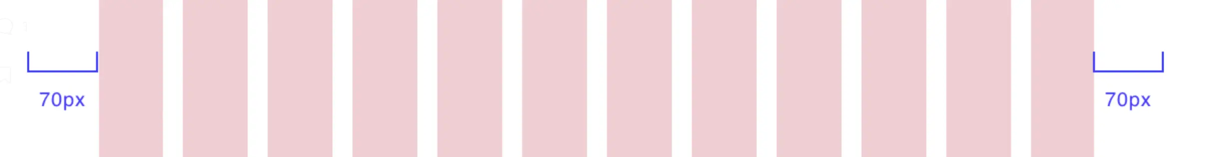
Columns are the thick colored blocks that make up the content width of your design. Field elements are to sit on a certain number of columns. Traditionally in a design system, the column width doesn’t change. But the number of columns varies from 12 on a desktop or 8 on a tablet and 4 on mobile. You can use anything you want, but most grids have 60–80px column widths. Choosing a column width that works for you is the most important since it’s the main determinant of your content width.
Gutters
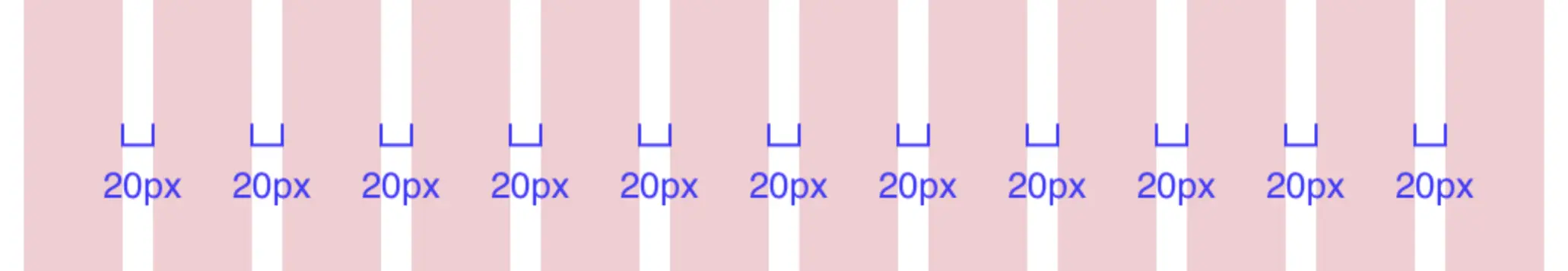
Gutters are the space between the columns. 20px is a standard gutter size, and this spacing will be critical when you have a masonry design or a grid of card elements, a simple example being a photo gallery.
Side margins
Side margins on mobile are usually 20–30px, and vary a lot between tablet and desktop. Whatever you choose as the side margin, will be the minimum white space you allow when you shrink your browser. When you expand your browser from this point, there will be white space until the next breakpoint.
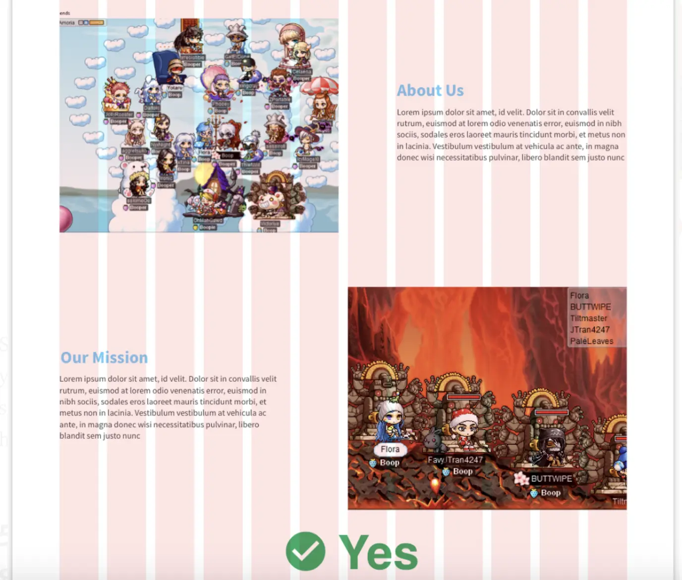
How to use grid in the right way
I’ve learned a lot from my leader how to apply the grid in design. We can’t just put elements inside the grid in a messy way. There are rules for it.
Field elements must sit on some number of columns
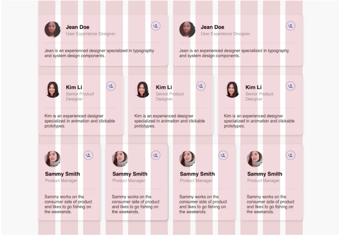
I mean, not all elements. As you see, just only the container must be between columns; the number of columns depended on the container’s size. It’s easier for the development team to code if we follow this rule, in case of force majeure (only if it make our UI better), we can create an exception.
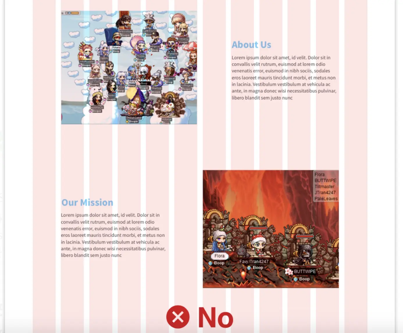
Do not leave field elements in the gutters
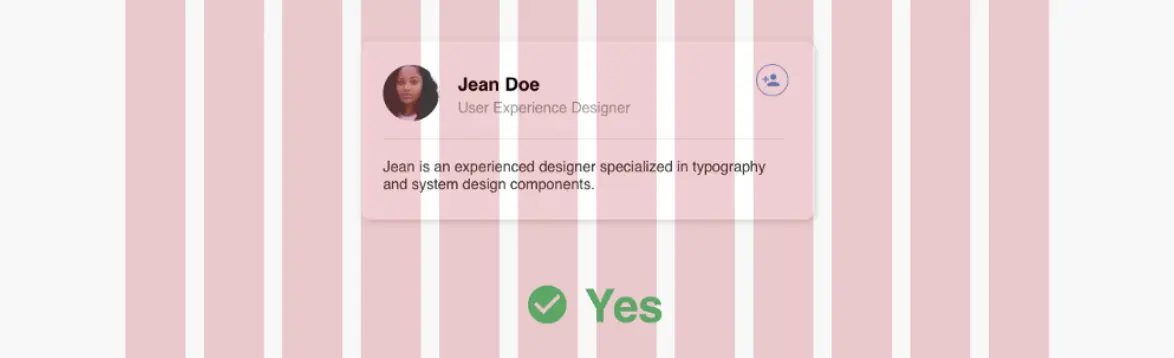
Your elements should sit within the columns and not be bleeding into the gutters. You CANNOT leave things in the gutters, that defeats the purpose of the grid.
It’s okay to nest elements inside fields that don’t align to the grid, as long as the parent field itself sits on columns
Sound weird right, everything I wrote about seems nonsense here. But It’s a trick to me, whenever you want to put an element that not fit to your grid (you should put them into the grid. But in case don’t do it make your design look better), all you need is creating a container fitted into a grid and put your elements into them.
The Dev team always want our design put into a grid to save their time coding, with this little trick, we're no longer in a war-zone with them
Do not use a column as outside padding unless intentional
We actually don’t need to indented 1 column each side, it will make our main images smaller, that’s the margin jobs already.
How these work in responsive
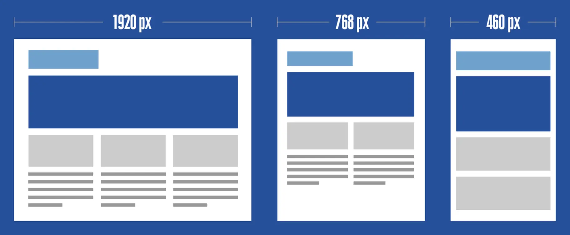
In a traditional design grid, the column widths and gutters stay the same, just the number of columns change. Why? And how does that work? This was to make things easier when you designed. If a set of three cards sat on 4 columns each on desktop, you would show two cards on a tablet and wrap the third one so that it’d show on a second row. Yay! You didn’t need to do any resizing, because you already knew that it sat on four columns. On mobile, the answer is easy too, you would show one card, and the rest stacked beneath it. If you wanted, you could also get creative and choose only to show one card on mobile or do a horizontal scroll. These breakpoints are the point of reference in code.
Fixed & fluid grid
A simple video to further understand Fixed & Fluid grid
Fixed grid
If your developer codes a fixed grid when you shrink from desktop to tablet, you’ll get to the next breakpoint, and there will be lots of side margins shrinking until the next breakpoint. The text doesn’t wrap, and images don’t dynamically change. If your developer is not careful in making sure all sizes are accounted for, there could be a missed breakpoint, and your designs might look cut off (hopefully this doesn’t happen). But wait as soon as you hit that 768px breakpoint, the design will snap into place, and things will look right for the tablet. If you go smaller than that, the same thing will happen, your design will look the same until you reach another breakpoint
Fluid grid
Now comes the beauty of fluid grids! As you shrink the window, things will change dynamically, your text is wrapping, and elements are getting narrower. However, these elements of yours still won’t change layout until you hit the next breakpoint that you designed.
And that’s it. I hope after reading this, you will have some sense to make your design look great started with good layout and grid
